R Bar Plots
Bar plot represents data in rectangular bar with heights proportional to the values that they represent. To draw the bar chart, we are using bar plot by using barplot() function. We can draw the bar both horizontally or vertically.
Syntax of Bar Plots
barplot(x,xlab,ylab,main,col)x - x is the data to plot on a graph.
xlab and ylab - xlab and ylab are the levels for x and y axis respectively.
col - col attribute sets color.
main - main attribute is to give a title to the graph.
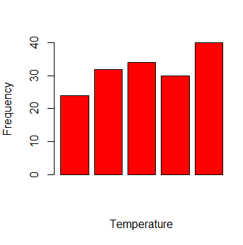
Example of R Bar Plots
In the below example, we generate a bar plot of vector elements.
temp <- c(24, 32, 34, 30, 40)
barplot(temp, col = 'red', xlab='Temperature', ylab='Frequency')
The above code generates this graph.